
The current market cycle is being shaped by more than earnings and headlines. To understand where equities may be heading next, investors need to watch a broader set of signals that connect growth, inflation, policy, volatility, and liquidity. The eight charts below do not provide a perfect forecast, but together they offer a practical framework for reading the market’s tone.
What matters most is not any one indicator in isolation. The useful insight comes from seeing how these charts interact: whether the yield curve is normalizing or flashing stress, whether the S&P 500 is climbing on expanding breadth, whether volatility is contained or rising, and whether liquidity is still supportive or beginning to tighten.
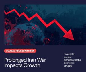
S&P 500 Snapshot
1. The Yield Curve: The Market’s Recession Compass
The yield curve remains one of the most closely watched macro charts because it reflects expectations for growth, inflation, and central bank policy. A steep curve often signals confidence in future expansion, while an inversion has historically been associated with slower growth and recession risk.
Growth and Recession Context
In the current cycle, the key question is not simply whether the curve is inverted, but whether it is steepening because growth is improving or because the front end is falling on rate-cut expectations. That distinction matters. A healthy steepening often supports risk assets, while a steepening driven by weakening conditions can be an early warning sign.
2. The S&P 500 Trend: The Broadest Snapshot of Risk Appetite
The S&P 500 is the cleanest single chart for understanding investor sentiment. A sustained uptrend usually tells us that markets are willing to pay for earnings growth, stability, and margin resilience. But the index alone can hide important weakness underneath the surface.
In this market cycle, investors are looking for confirmation from the trend itself: higher highs, higher lows, and strong closes above major moving averages. If the S&P 500 continues to rise while breadth narrows, that can indicate leadership concentration rather than broad participation. A healthy cycle generally shows both price strength and broad internal support.
3. Market Breadth: The Difference Between Leadership and Participation
Breadth charts measure how many stocks are contributing to the advance. A rally led by only a handful of megacaps can look strong on the surface while the median stock struggles. Breadth helps reveal whether the cycle is expanding or becoming more fragile.
Useful breadth indicators include the advance-decline line, the percentage of stocks above their 200-day moving average, and equal-weighted index performance. When breadth improves alongside the S&P 500, the market is usually building a more durable foundation. When breadth weakens, the risk of a correction increases even if the headline index remains elevated.
4. The VIX: Measuring Complacency and Stress
The VIX, often called the market’s fear gauge, tracks implied volatility in S&P 500 options. It tends to rise when traders expect more turbulence and fall when confidence is high. But the VIX is most useful when viewed as a context tool rather than a simple buy-or-sell signal.
Low VIX readings can suggest calm conditions and stable expectations, but they can also indicate complacency. Spikes in the VIX often accompany sharp drawdowns or event risk. In the current market cycle, a contained VIX alongside rising equities would support the view of a stable risk backdrop. A sudden move higher in volatility, especially if paired with weakening breadth, would suggest the cycle is under pressure.
5. Liquidity Indicators: The Hidden Fuel Behind Asset Prices
Liquidity is often the invisible driver of market performance. When financial conditions are easy, assets can rise even if economic data are mixed. When liquidity tightens, valuations can compress quickly.
Charts to watch include central bank balance sheet trends, bank reserve levels, money market fund flows, repo usage, and broader financial conditions indices. These measures show whether capital is abundant or becoming scarce. In practice, markets often respond to liquidity changes before they fully show up in growth data. That is why liquidity indicators can be some of the most important charts in the cycle.
6. Credit Spreads: A Real-Time Stress Test
Credit markets often tell the truth before equities do. When spreads between corporate bonds and Treasury yields widen, investors are demanding more compensation for risk. That can reflect deteriorating fundamentals, tighter funding conditions, or rising concern about default risk.
Narrow spreads usually indicate confidence and easy financing conditions, while widening spreads can be an early sign that the cycle is losing momentum. If credit spreads remain contained even as other charts wobble, the market may still be in a constructive phase. But if spreads begin to break out, equity investors should pay attention quickly.
7. Treasury Yields and Real Rates: The Valuation Pressure Gauge
Long-term Treasury yields and real rates matter because they influence equity valuation, especially for growth stocks. Rising real yields can compress price-to-earnings multiples by increasing the discount rate used to value future cash flows.
For this cycle, the most important question is whether yields are rising for the right reasons. Higher yields driven by stronger growth may be manageable for equities. Higher yields driven by sticky inflation or renewed policy pressure can become more problematic. Real rates, in particular, are worth watching because they often have a stronger effect on stock valuations than nominal yields alone.
8. Earnings Revisions: The Fundamental Confirmation Chart
No market cycle is complete without earnings. Price trends can run ahead of fundamentals for a time, but eventually profit expectations matter. Earnings revision charts show whether analysts are raising or cutting estimates across the market.
When revisions are improving, it supports equity multiples and helps confirm the broader trend. When revisions begin to roll over, that can be a sign that margins are under pressure or demand is slowing. In many cycles, earnings revisions act as the bridge between macro conditions and stock performance.
What These Charts Say Together
Individually, each of these charts provides a partial view. Together, they help define the market cycle more clearly. A constructive environment usually features a stable or steepening yield curve, a rising S&P 500, strong breadth, subdued but not complacent VIX levels, supportive liquidity, contained credit spreads, manageable yields, and improving earnings revisions.
When several of these charts begin to turn at once, the market is often signaling a phase change. That could mean a transition from recovery to expansion, from expansion to late-cycle pressure, or from stress to stabilization. Investors do not need to predict every turn. They just need a reliable dashboard for recognizing when the cycle is changing.
In that sense, these eight charts are less about short-term trading and more about context. They help investors move from reacting to headlines toward reading the structure of the market itself.